
Whoever said you should never judge a book by its cover clearly has ugly cover art on their books. I like artwork to say something, even if I can’t understand what it’s trying to tell me. When Happiness was picked up by Fledgling, I immediately knew what I wanted: “Make it ’90s inspired brutalism with a twist of M8 rave flyer,” I begged. Thankfully, I had the extremely talented Andrew Forteath (whose work can be seen all around the Scottish publishing industry and beyond) to translate and improve my ideas. Some publishers have a set style, an in-house aesthetic. Throughout the ’60s, Penguin Crime fiction wore jackets that were stylish, intriguing, and completely in their own weird world of bold colour and independent minded design. Many of the best were put together by Polish designer Romek Marber, whose stylish vision took cheaply made paperbacks and elevated them into something far more refined. Sometimes, I look at these book covers and wonder if they could work in today’s market, where recent trends seem to be heading in the direction of ‘enormous pink lady faces‘. Penguin Classics have a sort of cache now. They’re in vogue. They sell as postcards. They’re collected in a new book detailing their iconic designs. There’s probably a flat somewhere in Byres Road that has a framed photograph of a Penguin Classic on the kitchen wall. But less often seen are the striking bright green Penguin Crime covers. They pop up on Pinterest or Flickr, a reminder of an in-house style that’s no longer fashionable, yet still has real impactful power regardless.
Some of my favourites…

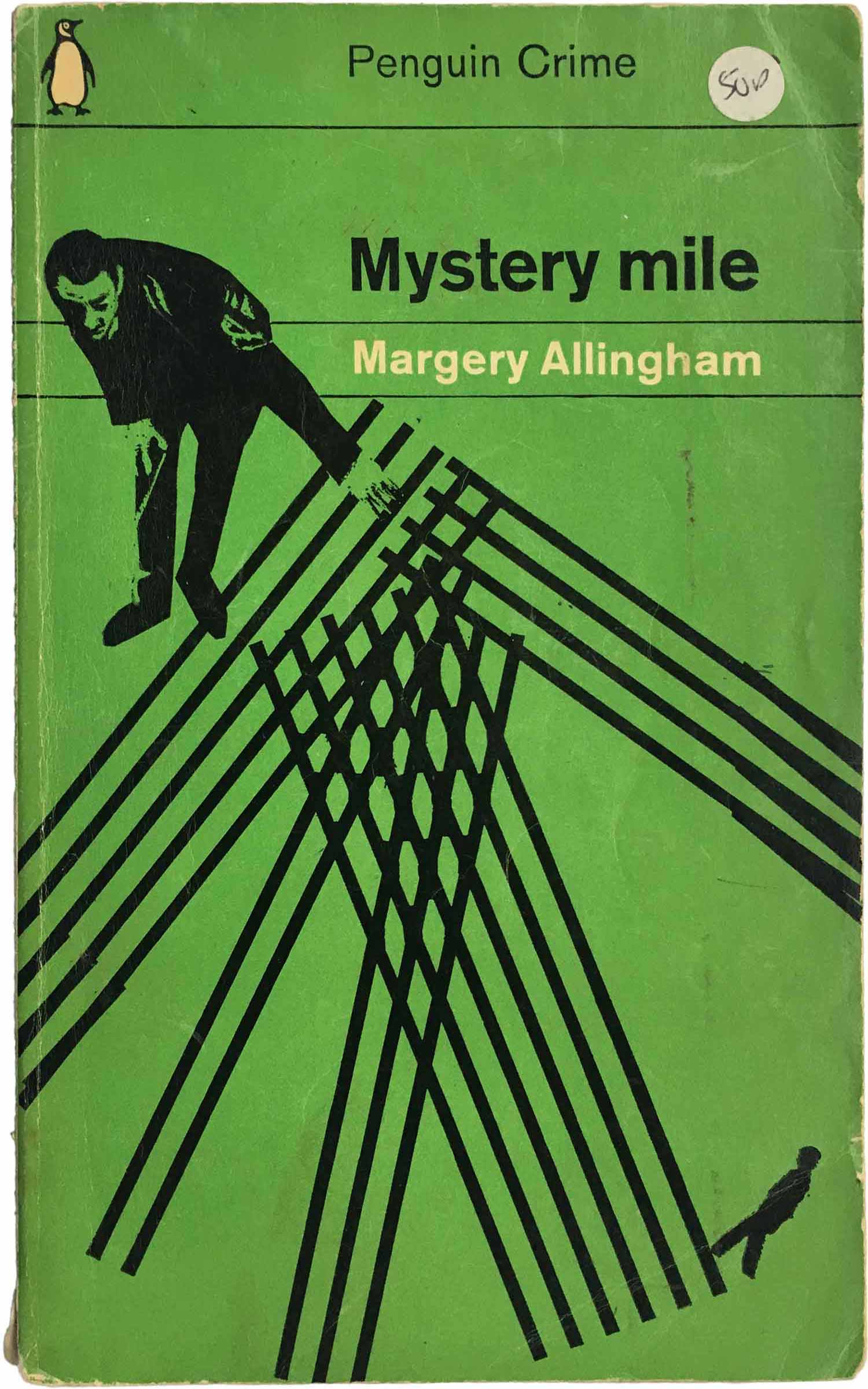
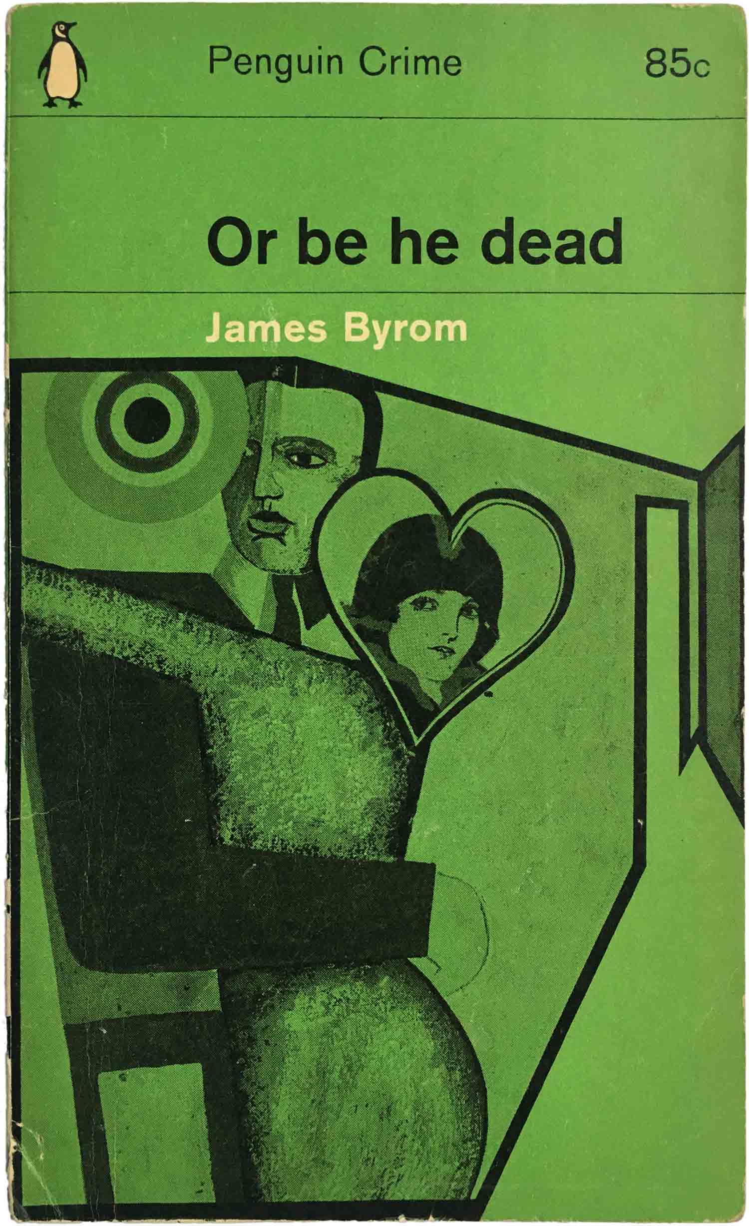
Looking over these covers, I prefer the simple designs, but I wouldn’t have this style for my own books, because I’m not sure they’d translate well in the current market. The truth is, the cover artwork for a book has to look good not just in print but as a thumbnail, which is how many people will first see a book while they’re shopping online. As an experiment, I’d love to see a publisher put out a crime novel with cover art in the style of Romek Marber, just to see how a modern audience would receive it.

But…why green? That’s what I don’t understand. Crime fiction, the word crime, evokes red. These days, you can’t really have red in your front cover because it translates badly on (of all places) Facebook. For some reason, red looks gritty when uploaded onto a Facebook post. Someone might be able to explain that to me, but I have no idea why this happens. Green isn’t a colour associated with crime fiction. It’s a colour of grass, snot, and the environment. Yet green is the colour Penguin Books went with for this range. Sometimes the covers came with a splash of obtrusive colour, usually a vivid red (they didn’t have to worry about Facebook back in the ’60s) and it works extremely well against the green and black. There’s something so bold and individual about these covers, which might explain why decades later, they’re still being looked at and discussed by a new generation of readers.

Leave a comment